I set up the site as a design portfolio to showcase my (mostly hypothetical) work. Here's a sketch for the homepage. I envisioned the foreground being a garden with light bulbs growing out of it. Each bulb would have the name of a different piece of design work I've done, and you'd click on it to see that piece. For some I used the actual projects we've done in class, the rest I made up. The background would be a verdant scene with grass, bushes, and trees, and you'd click on the trees to get my resume page, "about" page, and contact page. Click the image to see it at a reasonable size. To be frank, I have no idea how well I can pull of this idea or the other ones below, but I guess we'll find out!
Below is my sketch for the design of the About page. Pretty simple, just using the image of an open book, with my biographical info written across the pages. Click the image to enlarge.
Finally, below is the sketch of my design for the Contact page. A medium-size photo of me on the side, my social media links across the top, and contact info underneath, all superimposed over an image of an old-school rotary dial telephone. As always, please click the image to see it properly.
Monday, February 20, 2017
Monday, January 30, 2017
From Photo to Avatar: Before & After
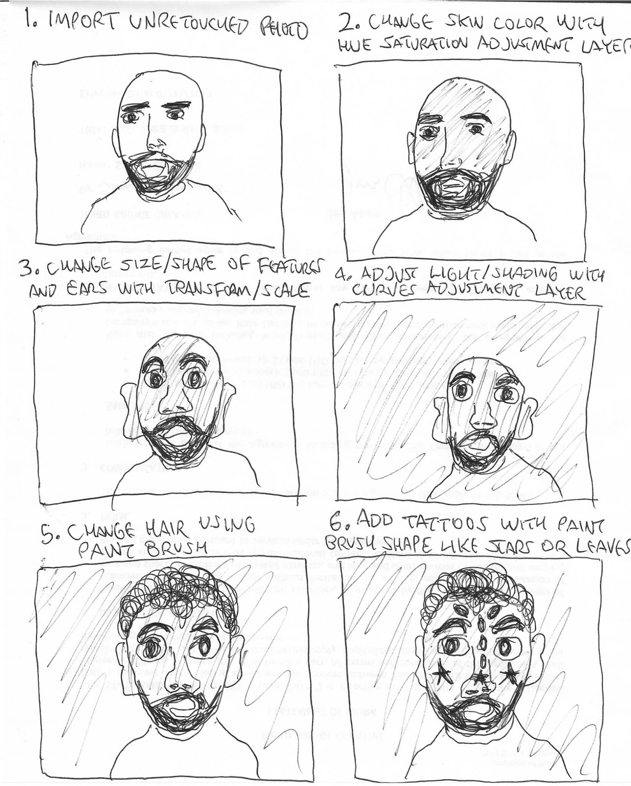
Here's the before and after for my avatar project. Just for fun I used a picture of myself. I pretty much stuck to the guidelines I laid out in my sketch. I changed the skin color with a hue adjustment layer, changed size/shape of features and ears (basically stretched everything out and made it bigger) with Transform/Scale, adjusted lighting with Curves adjustment layer, changed the hair using a paint brush, and created some tattoos by tweaking a butterfly shaped paint brush.
Here's the "before" image:
And here's the "after" image:
Here's the "before" image:
And here's the "after" image:
Thursday, January 26, 2017
Sketch for Avatar Project
Below are the basic steps I sketched out to turn my photo into an avatar image. I may end up deviating from some of what I've sketched out here depending on how things go once I'm in the process. As per usual, please click on the image to see it properly.
Sunday, January 8, 2017
Chet Baker Book Cover Completed
Here's my completed design for my Chet Baker book cover, click to enlarge and get a proper look at it. I varied it slightly from my original sketch ideas, but not too much. I did a blend on the trumpet image on the back to get it to fade into the background, but I wonder if I might have faded it too much. I used the Custom Shape tool to get the musical notes to make the publisher's logo. I used Bevel & Emboss on the top line of text on the back to get it to stand out in a different way. I used Free Transform to turn to rotate the text to vertical for the spine.
Friday, December 30, 2016
Chet Baker Book Cover
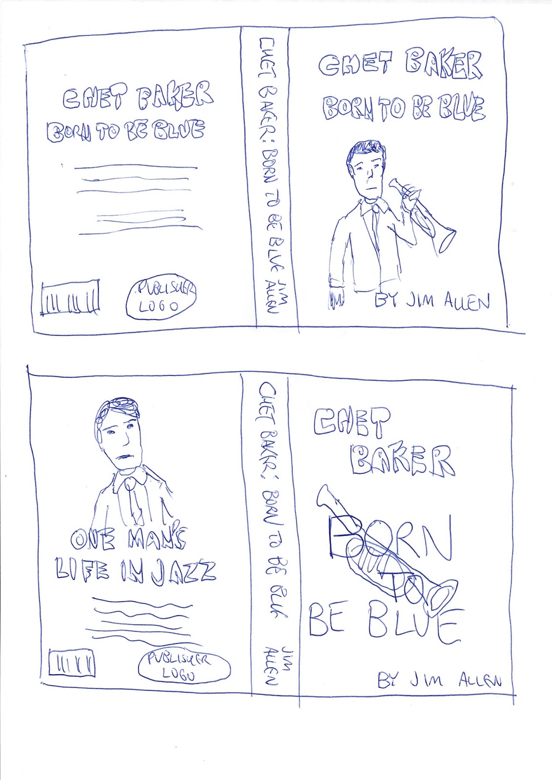
Here are a couple of the book cover design ideas I came up with. They're for a book about trumpeter and singer Chet Baker, the late jazz musician who made beautiful music but lived a tortured life.
The book title, Born To Be Blue, plays off of the music as well as the tragic nature of his life, and in both of my concepts I'd use shades of blue to bring that idea over into the cover art as well.
For the first idea, I'd import an image of Baker for the front cover, probably with something like 50 percent opacity to give it a ghostly feel.
For the second, I'd feature a trumpet instead of an image of Baker, but I would give it the same treatment. I'd use his image on the back, and I'd take a different approach with the text on the back too, as shown.
The book title, Born To Be Blue, plays off of the music as well as the tragic nature of his life, and in both of my concepts I'd use shades of blue to bring that idea over into the cover art as well.
For the first idea, I'd import an image of Baker for the front cover, probably with something like 50 percent opacity to give it a ghostly feel.
For the second, I'd feature a trumpet instead of an image of Baker, but I would give it the same treatment. I'd use his image on the back, and I'd take a different approach with the text on the back too, as shown.
Saturday, December 17, 2016
Social Awareness Poster: Not This Time
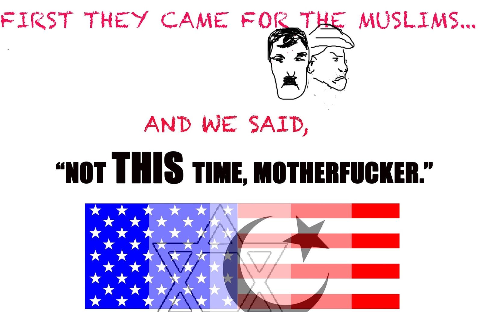
Here's my final poster (click to get a bigger, better look).
I decided to go with the suggestions to use my own drawings for the faces like I did in the sketch instead of using actual photos. I think it was a good suggestion, I wouldn't have thought of it otherwise, but I feel like it adds a nice touch. I used the brush tool to do the sketches over from scratch. It was the first time I'd used it so it took a little getting used to but I feel like it turned out OK.
I decided to keep all the elements as simple as possible and not have anything in the background.
I felt like one of the most important things was decided which font to use for the text, so I literally went through every single font for both types I used to figure out which one seemed to work the best.
I had a little trouble getting the right level of opacity in order to blend the three images on the bottom. I don't feel like it looks quite right, it seems a little clumsy-looking to me, I wonder if there would have been a better way to go about it.
I decided to go with the suggestions to use my own drawings for the faces like I did in the sketch instead of using actual photos. I think it was a good suggestion, I wouldn't have thought of it otherwise, but I feel like it adds a nice touch. I used the brush tool to do the sketches over from scratch. It was the first time I'd used it so it took a little getting used to but I feel like it turned out OK.
I decided to keep all the elements as simple as possible and not have anything in the background.
I felt like one of the most important things was decided which font to use for the text, so I literally went through every single font for both types I used to figure out which one seemed to work the best.
I had a little trouble getting the right level of opacity in order to blend the three images on the bottom. I don't feel like it looks quite right, it seems a little clumsy-looking to me, I wonder if there would have been a better way to go about it.
Sunday, December 11, 2016
Social Change Poster Project: "Not This Time"
Here's the main layout sketch for my poster, which I'm giving the working title "Not This Time." The text is: First they came for the Muslims...and we said, "Not THIS Time, Motherfucker." On the top left will be images of the faces of Hitler and Trump (not too subtle, eh?) with some opacity added. Underneath the last line of text will be an American flag, Islamic symbol and Star of David interposed over each other.
Below is a closeup of the Hitler and Trump faces visible behind the lettering.
And finally, here is a closeup of the flag, Islamic symbol, and Star of David superimposed over each other:
Subscribe to:
Posts (Atom)